Archives
-
 My friend recently relayed a story to me that I had to pass along.
As it happened, my friend walked into the local grocery store to do some shopping and upon entering, noticed a "ridiculously large display of Coke in the front entry way".
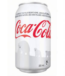
The thing to note is that all the cans of Coke were white as part of their collaboration with the World Wildlife Fund to save the polar bears.
Generally speaking, it's a great idea. Coke has been using polar bears in it's ads since 1993 and so there's clearly a connection there that they could exploit to join the throngs of other corporations that are engaging in causes to grow positive brand impressions.
But in an effort to brand well, Coke is falling prey to their own brand success.
At the top of the huge grocery store display, there is a neon colored, 8.5 X 11 sheet that reads simply, "This is Coca-Cola".
The color red is so incredibly well branded, that people are walking right by the white cans without even knowing it's Coke. And it's safe to assume it's not just one or two people - it's enough to warrant a makeshift sign to keep the store employees from having to explain it again and again.
That's an amazing story.
We're all about branding and there's simply no arguing the fact that Coke is one of, if not the biggest brand out there. But clearly, being the biggest isn't always easy. Sometimes, it actually introduces a whole set of challenges of it's own.
-
 My friend recently relayed a story to me that I had to pass along.
As it happened, my friend walked into the local grocery store to do some shopping and upon entering, noticed a "ridiculously large display of Coke in the front entry way".
The thing to note is that all the cans of Coke were white as part of their collaboration with the World Wildlife Fund to save the polar bears.
Generally speaking, it's a great idea. Coke has been using polar bears in it's ads since 1993 and so there's clearly a connection there that they could exploit to join the throngs of other corporations that are engaging in causes to grow positive brand impressions.
But in an effort to brand well, Coke is falling prey to their own brand success.
At the top of the huge grocery store display, there is a neon colored, 8.5 X 11 sheet that reads simply, "This is Coca-Cola".
The color red is so incredibly well branded, that people are walking right by the white cans without even knowing it's Coke. And it's safe to assume it's not just one or two people - it's enough to warrant a makeshift sign to keep the store employees from having to explain it again and again.
That's an amazing story.
We're all about branding and there's simply no arguing the fact that Coke is one of, if not the biggest brand out there. But clearly, being the biggest isn't always easy. Sometimes, it actually introduces a whole set of challenges of it's own.

Leave a Comment